

Storytelling Through Colour Design at Walt Disney Imagineering
This article summarises the content of Heidi Rosendahl’s NextGen Showcase presentation on Colour Design, from 8th January 2024.
Since 1995, Heidi Rosendahl has been a colour designer, field art director and production designer at Walt Disney Imagineering. In her talk for NextGen Showcase participants, she shone a light on the artistry of colour design and illustrated the integral role it plays in storytelling at the Disney parks and experiences. Let's take a look at colour through the eyes of an Imagineer!
The Role of a Colour Designer
A Colour Designer collaborates with colleagues across the creative team to develop a project’s colour palette. It is their responsibility to communicate colour intent through several mediums, including painted models, colour boards, and paint samples. Each specifies the tone, styling and level of complexity of a themed paint finish.
Colour Designers are the colour champions of a project, promoting colour consistency in every discipline. Heidi emphasised the importance of the colour designer’s role in ensuring consistency:
“We want to make sure that everything looks collaborative, designed with a purpose, thought and partnership.”
The Colour Design team provide documentation during the bid process, for submittals, and field implementation, collaborating closely with architects, interior designers, lighting designers, and graphic designers to ensure that every element, from foliage to a ride vehicle, has been accounted for.
Colour Designers partner with the character façade team to create and implement field sample programs, to define strategies and techniques for field themed character painting, and for use as a contractor training program.
Storytelling With Colour
Colour can evoke memories, emotions, and a sense of nostalgia. It can transport guests to a distinct time and place, and in theme park design, placemaking is one of the core objectives.
“At Disney, everything that we do is about the story.”
Colour assists Imagineers in storytelling. It helps to pinpoint the character of a story’s place and time, setting the mood and emotional tone of the story, and reinforcing its meaning.
Throughout Disney theme parks, the design of colour is highly coordinated and deeply considered. Each element, from character facades to ride vehicles, fencing to rockwork, show sets to graphics, has been designed in incredible detail.
“Everything that a guest sees in a theme park - whether it’s the castle or a trash can - it’s all got colour on it.”
Character Paint Finishes
Imagineers use character paint finishes to make the new look old and the manufactured real by using well-established film industry techniques. The finishes bring to life the design intent established by the creative team and contribute to the believability of the story, place and time.
The concept of colour design first emerged in the film industry, where scenic artists employed tried-and-tested techniques to ensure realism. However, there is a clear difference between a film and a theme park. Whilst a film set may only need to look convincing for a moment and from a specific angle, a theme park is a 360° environment that undergoes heavy traffic, adverse weather and guest interaction.

A character paint finish at Star Wars: Galaxy's Edge. Image courtesy of Heidi Rosendahl / Walt Disney Imagineering.
Project Phases
Blue Sky
In the blue sky phase, no idea is too big and the sky is the limit. The core creative team gathers to generate ideas and plant the seed of an idea. They create preliminary storyboards which define the essence of the next attraction or experience and describe what shape it could take.
Concept
At this stage, the core creative team communicates their vision to the wider project team during preliminary creative meetings. Thorough research begins, based on the ideas generated during the blue sky phase. This often involves several research trips to capture photo references.
At least one Imagineer will represent each department, focusing on the research most relevant to their discipline. Whilst a Colour Designer may focus on photographing colours and textures in granular detail, an architect may capture the overall form of a building.
Creative, technical and financial feasibility studies are conducted at this stage to ensure that the finished project can deliver on its promise and that all deliverables are on track.
Design
It is at this stage in the process when colour scripting takes root and many of the details are defined. For attractions and experiences based upon films, the films themselves and any supporting artwork are key reference points for the Imagineers.
The production of scale models and colour boards begins in this phase. A scale model represents the finished attraction or themed land in 3D table-top form. Often a white card model is created first which only conveys the shape and scale of the design. A colour board is a 2D architectural elevation that shows the colour intent of a design.
During this stage, Heidi emphasises how important it is to communicate as much information as possible through a variety of 2D and 3D mediums. Doing so allows project partners and the client to calculate the labour required to realise the creative vision accurately.
When each discipline is closely aligned, the project is contracted and budgets are carefully calculated. The type of paint chosen - for example, polyurethane, metallic or UV reactive paints - can significantly increase the cost of a project.
Implementation
Once the contracts have been awarded, the design begins to be realised. The 2D and 3D designs and documents are handed over to the on-site team to implement. Sample boards are created to test and sign off character façade techniques. Throughout the process, a close eye is kept on the cost of materials so that adjustments to the budget can be made where necessary.
Design Tools
Over Heidi’s career at Walt Disney Imagineering, the tools used in the design process have changed dramatically. The ‘old school’ methodology involved having physical, tangible items in hand that conveyed the design. With the advent of digital design, Heidi believes the process has been made more efficient in some ways, yet more challenging in others.
Since the human eye sees colour differently, every individual will perceive different nuances in colour. Furthermore, the appearance of colour can vary drastically from monitor to monitor, and the output of different printers can also vary significantly.
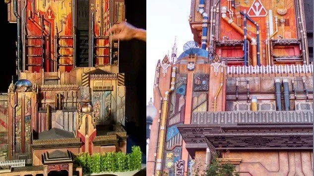
A scale model of Guardians of the Galaxy - Mission: BREAKOUT! Image courtesy of Heidi Rosendahl / Walt Disney Imagineering
Heidi explains that the easiest way to convey a design to someone is with a tangible scale model. In the case of Guardians of the Galaxy - Mission: BREAKOUT!, the construction was fairly limited, instead cladding and a character paint finish were applied to the existing façade to dramatise the transformation.
Colour Boards
Colour boards are realistic renderings of architectural drawings that represent 60-100% of the finished product. A colour board becomes a map for the painting contractor, allowing them to know exactly which colour to apply to each part of a facility. Facility painters apply standard or clean base paint coatings, and theme paint teams apply artistic techniques.
The colour board for Avengers Campus was one of the first to be fully digital. The rendering was made by a concept architect, and then the base paint colours were labelled so they could be placed onto the façade. The theme paint team created samples that were approved before the final project was delivered.
“You can think of colour boards sometimes as colour by numbers. It’s a giant colouring book page that we hand over, and it’s a road map.”
Communication is Key
Heidi emphasised the importance of clear communication on projects, especially when working in different parts of the world where colour systems vary. The Colour Design team has to strike a balance between choosing paints that align with the creative intent as well as those that are readily available and approved for safe use.
Ride Vehicle Colour Boards
Walt Disney Imagineering collaborates closely with ride manufacturers to choose finishes that will withstand the heavy guest impact, whilst serving the story.
Character Paint Scope
Base paint is typically bid as part of the general contractor’s scope. A theme paint finish is often bid separately as a specialist skill set is required.
The Colour of Cars Land
One of the finest examples of colour design in a Disney theme park is Cars Land at Disney California Adventure. The landscape, inspired by Utah’s iconic red rocks, employs atmospheric forced perspective to ‘grey off’ and ‘blue off’ the rocks in the distance - or the ‘Cadillac fins,’ as Heidi calls them. The closer they are to guests, the more saturated the rocks become, to augment the impression of scale.

Cars Land at Disney California Adventure. Image courtesy of Disney Parks Blog (2022)
The Imagineers conducted extensive research into the natural rock formations at Bryce Canyon and Zion U.S. National Parks. Over a decade after completion, the land looks as great as ever; a testament to the development of products that have excellent UV stability and longevity.
When creating theme park environments, Imagineers are bound by the laws of nature. Imagineers must also consider the sun's direction in relation to the orientation of each land.
During the early design stages of Cars Land, Heidi and her fellow Imagineers rolled a large scale model into the parking lot outside the Walt Disney Imagineering studio in Glendale. By orienting the model correctly, the sun would hit from the correct angle, which ensured that the Imagineering and Pixar teams were designing and seeing the land as it would appear upon completion.

A scale model of Cars Land at Disney California Adventure, displayed during the “Road to Cars Land” exhibit at Disney California Adventure. Image courtesy of Loren Javier via Flickr (2012), used under Creative Commons License.
The Legend of 'Go-Away Green'
To conclude, Heidi shared insight into the famous ‘Go-Away Green’, a topic popular among Disney enthusiasts. She emphasised how ‘Go-Away Green’ is much more of a philosophy than a specific shade of green. The theory is that infrastructure painted in this type of colour disappears into the background when squinting.
“It’s a philosophy, not a colour. It’s the idea that you can choose a colour that blends into a background without calling attention. Sometimes it’s go-away brown or go-away beige.”
We at NextGen Showcase would like to express our gratitude to Heidi Rosendahl for her contributions to our Educational Program. Thank you!
For more information on the NextGen Showcase Educational Program, go to: NextGenShowcase.com
This article was written by NextGen Showcase Alumni: Lewis Brown, with support from our Editor, Rosie Willoughby.
Image sources
Disney Parks Blog (2022), https://disneyparks.disney.go.com/blog/2022/06/10-ways-to-celebrate-cars-lands-10th-anniversary-at-disneyland-resort/
Javier, L. (2012), “”Road to Cars Land” exhibit at the Blue Sky Cellar Preview Center”, via Flickr, Available at: https://www.flickr.com/photos/lorenjavier/6954850593/in/photostream/ (Accessed 23/01/2024)
All other images courtesy of Heidi Rosendahl / Walt Disney Imagineering (2024)